I’m a visual designer, data visualization designer, and UX researcher. In my ten years of experience in communication design and design management, I mainly focused on data visualization, infographic design, diagram design, visual identity system, and typography. Recently, I received my master’s degree in Data Analytics and Visualization from Pratt Institute and actively looking for opportunities that can utilize the combination of my skills in design, data, and user experience.
Sample Works
The Colorful Lego: Visualize the History of Lego Bricks’ Color Expansion
According to a 2018 Lego study, “the vocabulary of bricks has increased significantly resulting in sets sharing fewer bricks.” Tracing the number of Lego bricks over time may be telling of the increasing specialization and complexity of Lego sets. Looking at the number of specialized pieces in relation to interchangeable pieces may also help us determine if increased specialization has resulted in fewer shareable bricks.
Look into the “Side Facts” of COVID-19: A Practice of Data Visualization Automation
This project aims to understand the side-facts about COVID-19, to see how people in different countries reacting to the reported numbers about the pandemic. It is also a project that aims to practice my python skills. The whole data ETL and visualization process is automated with Python.
Network Analysis on Soccer Player in FIFA 2019: Human Grouping vs Clustering
In this network analysis practice a network among the registered players in FIFA 2019 is created, with the nodes as players, and the edges as the shared skillset. In this network, the players have more similar skill set will have a stronger connection.
The Colorful NYC: A Map of Street Trees’ Blossom and Defoliation
In this network analysis practice, a network among the registered players in FIFA 2019 is created, with the nodes as players, and the edges as the shared skillset. In this network, the players who have more similar skill sets will have a stronger connection.
Tools Used: QGIS R Adobe Illustrator Digital Color Meter
At Anthem, internal users track and analyze different types of data every day. This dashboard is specifically designed for data analysts and decision-makers to dig into and investigate the usage of different functions on the SmartHelp platform, from different perspectives.
Tools Used:
Adobe Illustrator Sketch
Campaign Statistics Dashboard for Anthem’s SmartHelp Platform
Please contact me to access the protected contents.
This is a dashboard designed for the same platform at Anthem, which helps analysts track the health of invite-to-register campaigns. In order to fit different users’ needs, a two-tab structure was introduced to help users view either the process flow using a Sankey plot, or compare it to other campaigns by count/rate using a horizontal bar chart.
Tools Used:
Adobe Illustrator Sketch
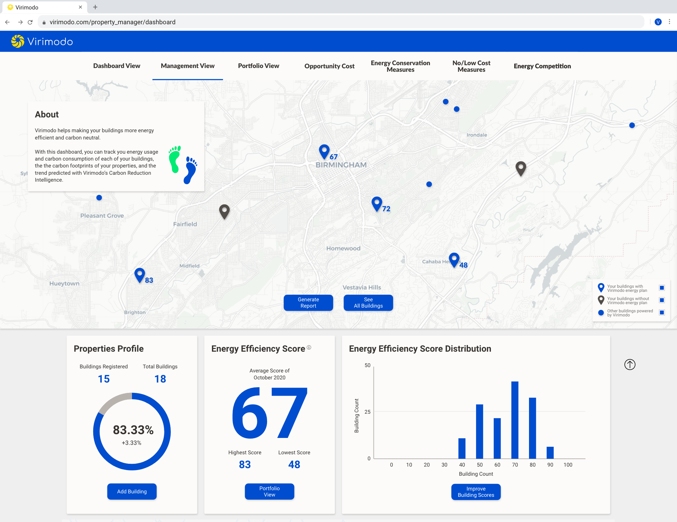
Virimodo’s B2B Energy Data Tracking Platform
Virimodo is an SaaS company that helps customers cut energy waste and improve their carbon footprint. For such purpose, I designed and built a dashboard that tracks clients’ energy uses, carbon footprints, greenhouse gas emissions, and so on. In addition, a variety of different views and other functions have also been added to the platform and created a one-stop energy-related-data portal.
This is a hypothetic website redesign project for a non-profit organization called Arts for All, which offers accessible artistic opportunities to children in the New York City area who face different barriers to exploring the arts. As a team member, I contributed mostly in visual design and prototyping process.
After conducting qualitative and quantitative user studies (interview, observation, and questionnaire), card sorting and tree testing, and competitive analysis to generate a draft site map, the team created a low fidelity website accordingly. We then ran some usability test with the low-fi draft and adjusted the site map, and finally produced our final high fidelity prototype. Due to the scope of this project, we focused on improving the experience of Making a Donation and Volunteering.
Gang Qiao Design Consultant is a company that organizes design competitions, biddings, and seminars. They link the government, designers, and clients, functioning as the motive power of design business. This business model has reminded me of Newton’s Cradle, which has a consistent motive power and two “sides”. In this context, I consider it as the clients and the designers, and Gang Qiao acts as the connection between them.
Tools Used:
Adobe Illustrator Adobe Animation
“On Typography”
This is an experimental project discusses the voice in mind when a second language (Mandarin) speaker is reading an English article.
The reading difficulty was presented by the messiness, duplicants and complexity of the typography. In the video version, I dubbed a sound track that literally reads out the voice in my mind while reading an English article four years ago.
Designed and helped develop Tableau data visualization dashboards that mainly face Anthem’s internal executive level audience, provides actionable facts and information to help them make decisions.
Executing UI/UX design and data visualization design for Anthem’s SmartHelp, a user behavior analysis tool, building descriptive stories about usage statistics of app functions and campaign progress.
Inspected a variety of geographic information datasets with ArcGIS;
Cleaned, and manipulated some of the datasets to fit them with the GIS data format;
Compiled metadata for the datasets;
Utilized R, Shell, Excel VBA, and ArcGIS Workflow to automize repetitive work procedure and accomplished over 2800 metadata entries, which was beyond the position’s intention.
Managed the visual identity system, keeping all SCD’s visual products meeting the standard;
Designed nearly over a hundred visual material for SCD hosting/organizing events/competitions, including posters, catalogs, social media, presentation slides, and etc.;
Controlled the quality of all of SCD’s visual contents, web-based or printed;
Co-organized SCD’s many design competitions, workshops, exhibitions, and public events, mainly focused on the venue assembly, schedule planning, and visual content supporting;
Provided visual design assistance for research projects related to urban planning, architecture, and ethnology;
2014, Co-curated SCD’s exhibition on UABB (Shenzhen\Hongkong Urban\Architecture Bi-city Biennale), developed the visual system and contributed to the space design of the exhibition;
2015, Refurnished SCD’s official website, redesign the website’s visual presentation, and contributed to the management of the website’s front-end development.
ReTumu is an NGO that focuses on studying the relationship between construction and demolition in the urban/rural area. I helped them with advertising graphics as well as the visual material design for their research reports.
Provided artistic suggestions for design projects to the lead designer;
Created oil paintings and sculptures that met project needs.
Skills
Technical Skills
Adobe Creative Suite Tableau Sketch ArcGIS QGIS Excel Powerpoint R Python (pandas, numpy, altair) SQL (MySQL, PostgreSQL) Shell (Bash) HTML / CSS
Functional Skills
Data Visualization Graphic Design Typography Design Management Visual Identity System Management User Interface Design Usability Research Information Architecture Data Analysis Spatial Analysis Database Design and Development Presentation Mentoring